Walgreens Specialty Pharmacy Rebrand
When a Specialty Pharmacy Is Acquired by a Retail Giant
I rebuilt a retail system into a clinical-first component library, one that met higher accessibility standards while staying true to the parent brand, then scaled it across patient experiences like New Patient Onboarding and EZ Reorder, increasing patient adoption by 5% after the rebrand.
Company
Walgreens / Alliance Rx Specialty Pharmacy (Pharmtech)
Role
End-to-end design system rebuild, reskin of digital products (all hands)
Team
Design manager, engineers, design team members
Deliverables
Figma Component Library, digital products "reskined", WalgreensSpecialtyRx.com 1.0 and 2.0
Overview
When AllianceRx, A Walgreens Pharmacy, was fully absorbed into Walgreens, it triggered a complete rebrand. Swapping AllianceRx's blue and purple palette for Walgreens' crimson and neutrals meant rebuilding every digital product in the AllianceRx portfolio from the ground up.
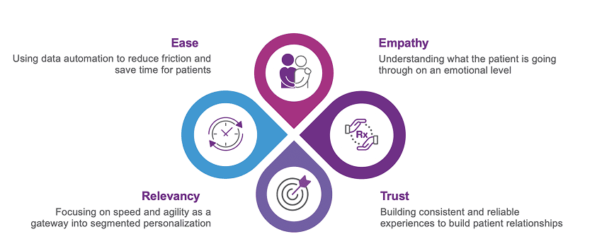
AllianceRx also built its experiences around digital-first design principles, the opposite of Walgreens' retail-first thinking. Those principles guide every decision the AllianceRx Strategy and Experience Team (SET) makes, and they're a big reason the team's core product, EZ Mobile Reorder, holds a 99% patient satisfaction rate.
Core Problem
Walgreens' Design System is built for retail. It optimizes for e-commerce: smaller fonts and tighter margins to fit more content on screen, with visual density that serves browsing and product discovery. That logic makes sense for its intended audience.
Specialty Pharmacy patients are a different population entirely. Many are managing chronic or terminal conditions, such as Parkinson's or cancer, that affect how well they can interact with a digital interface. Tremors make tapping small buttons difficult. Vision impairment from medication or disease progression makes small type a real barrier. A cluttered screen doesn't just look bad. It makes managing your own health harder than it needs to be.
AllianceRx's design system was built to 100% WCAG 2.1 AA accessibility standards, with most components meeting AAA, a higher bar than the retail system meets. Larger type, bigger touch targets, and far more breathing room between elements weren't aesthetic choices. They followed directly from AllianceRx's guiding principles, and adopting Walgreens' Design System as it stood wasn't an option.
Key Differences
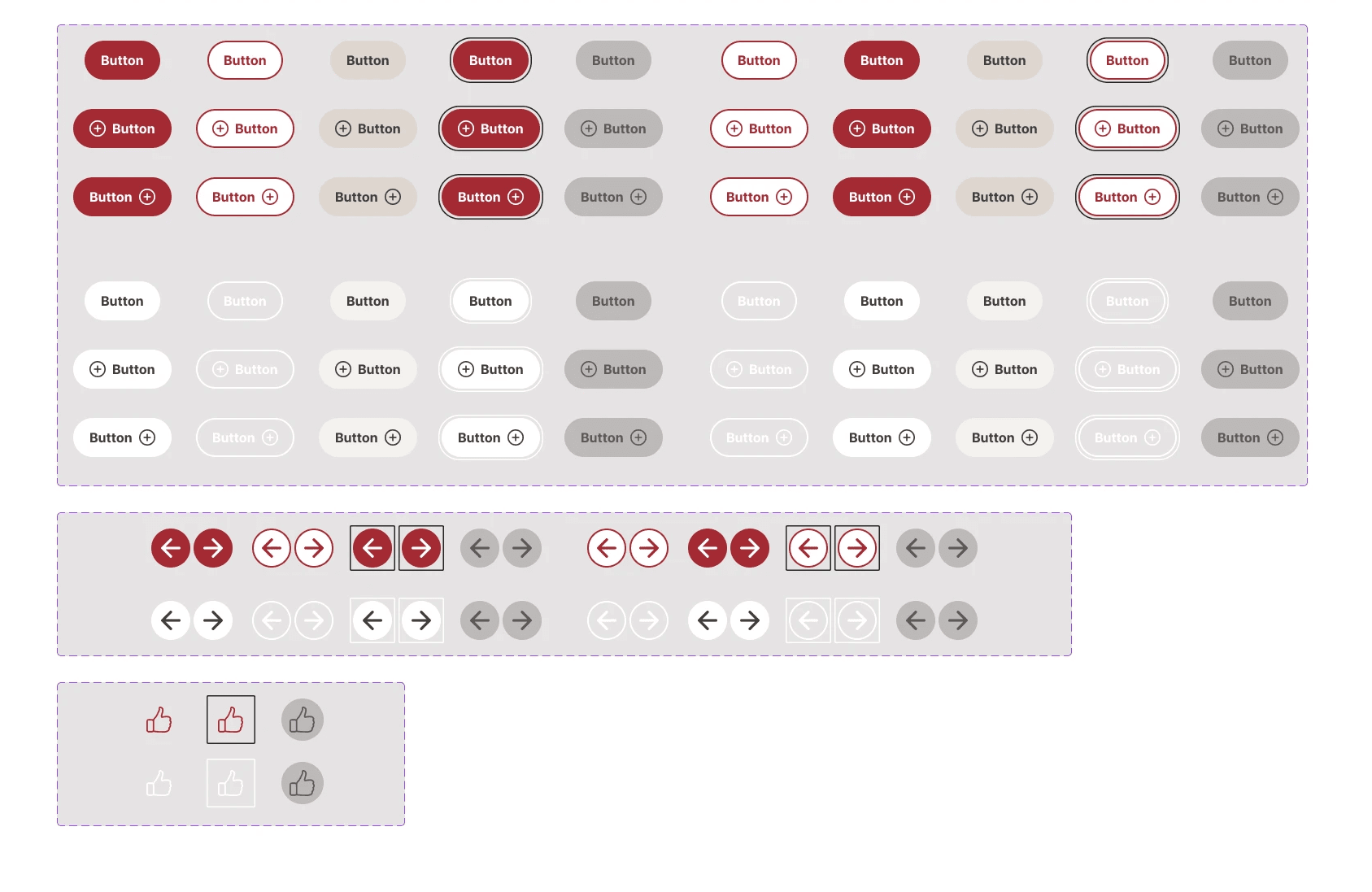
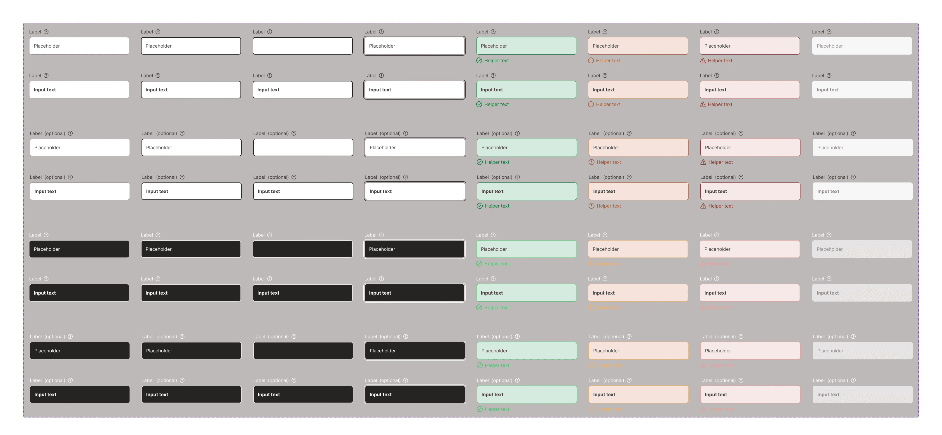
Walgreens' Design System (Retail)
Optimized for e-commerce conversion
High visual density, promotional hierarchy
Aims for WCAG 2.1 AA accessibility (does not meet AA 100%)
Smaller type and margins to fit more content
Designed for incidental browsing
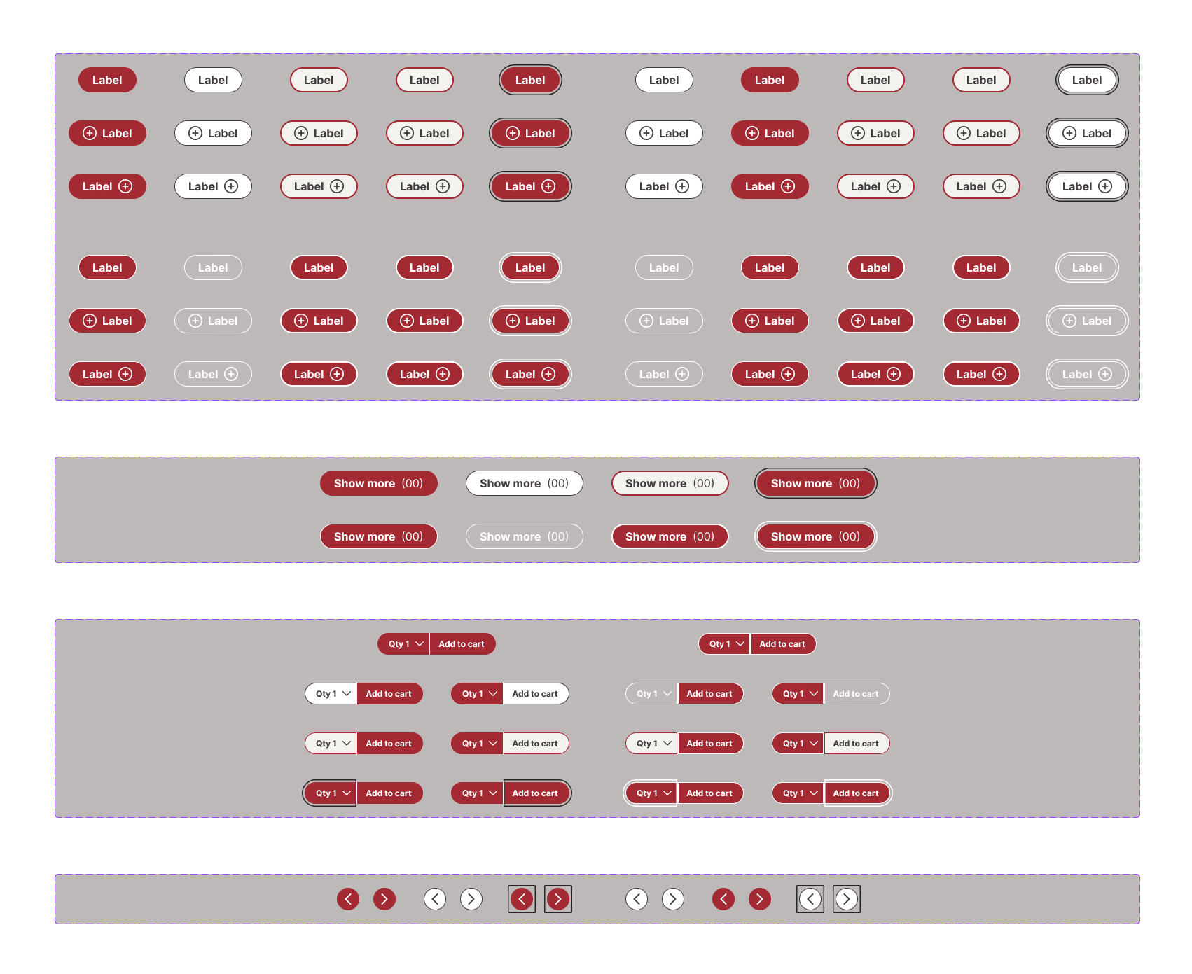
WSP Design System (Clinical)
Optimized for task completion and safety
Generous negative space, minimal visual noise
Aims for WCAG 2.1 AAA accessibility (minimum 100% AA and 70% AAA)
Larger type and touch targets for impaired motor/vision
Designed for patients managing serious conditions
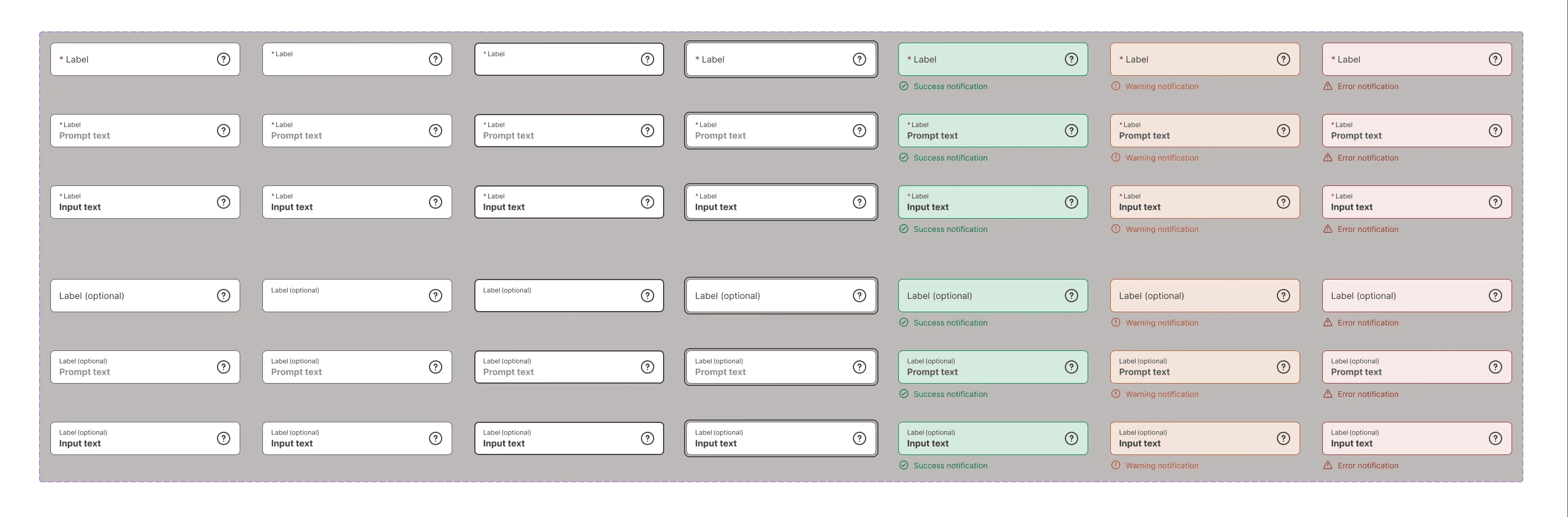
New Walgreens Specialty Pharmacy Design System
Walgreens' Retail Design System
New Walgreens Specialty Pharmacy Design System
Walgreens' Retail Design System
Product Strategy
We didn't have the luxury of a full design system rebuild before the rebrand needed to go live. The business required shipping products with the new brand identity on a fixed timeline, so we made a deliberate call: reskin all existing products quickly to meet the rebrand deadline, then build the true WSP Design System in parallel. The reskin process itself would surface exactly where the Walgreens' Design System components failed our patients.
That constraint turned out to be useful. The reskin was an accelerated audit. Every moment a Walgreens component didn't translate (a button too small, a label too light, a state pattern too ambiguous) became a documented design decision for the new system.
Phase 1 • Reskin & Rebuild in Parallel
Rapid rebrand across all active products
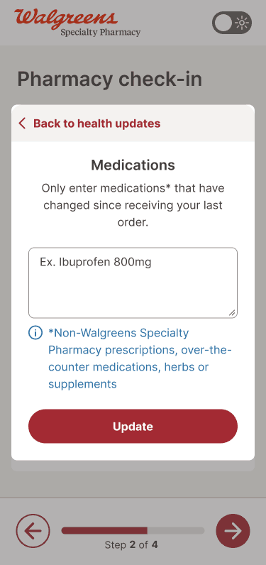
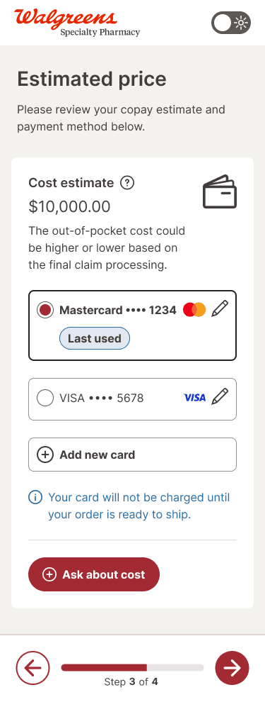
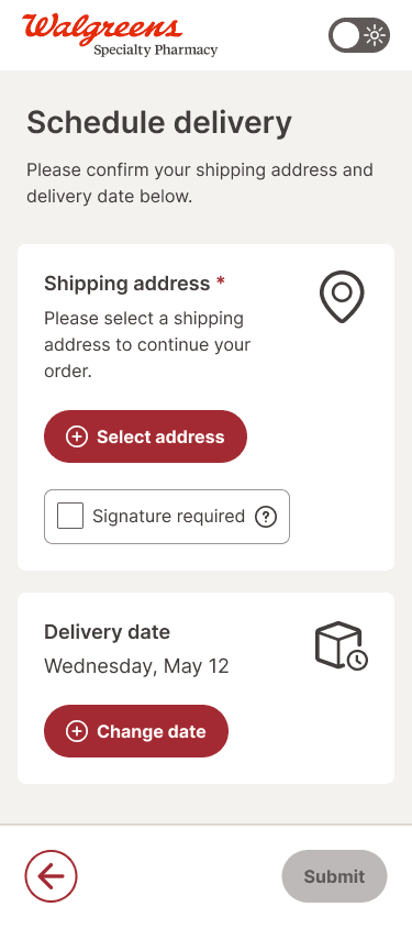
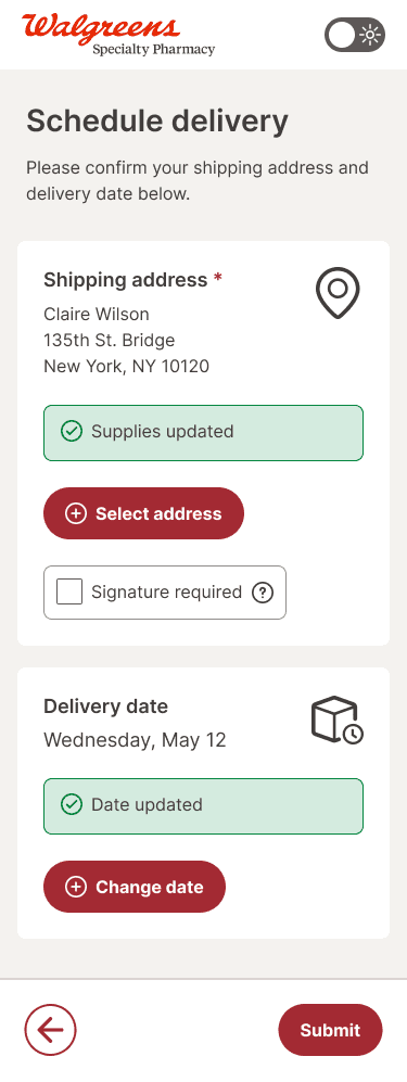
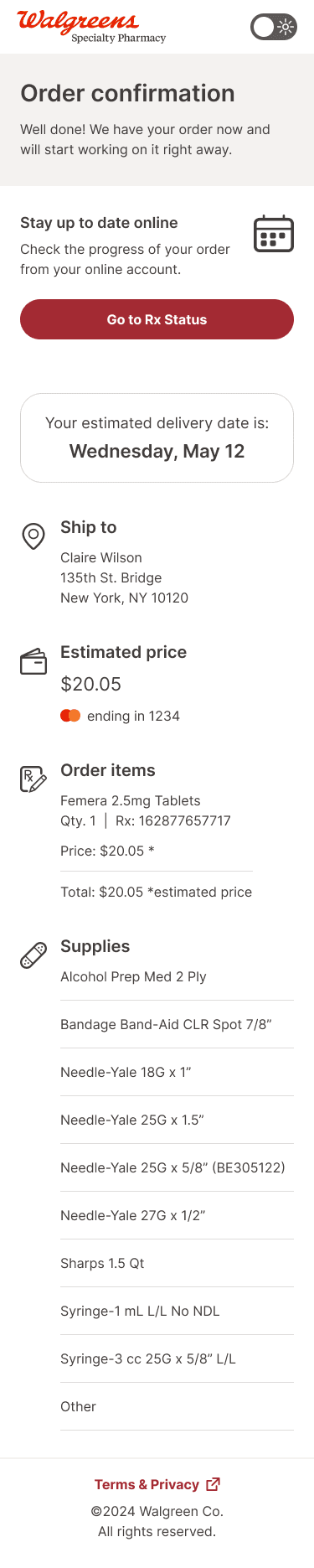
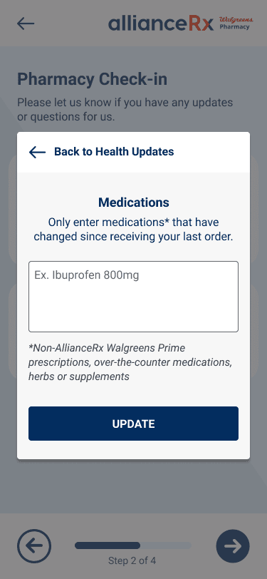
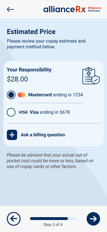
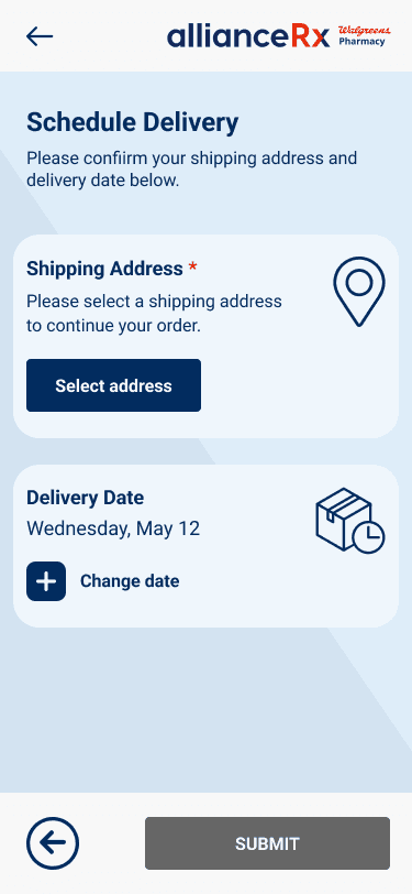
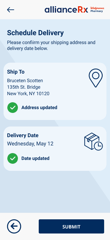
Applied Walgreens crimson and neutrals across EZ Mobile Reorder, New Patient Onboarding (NPO), and Walgreens Mail Service. Preserved AllianceRx's clinical component logic while meeting brand transition deadlines.
WSP Design System built alongside the reskin
As reskin decisions revealed CARE's clinical gaps, each gap became a design system specification. Components were rebuilt from the CARE foundation with AAA compliance, increased spacing, and clinical interaction patterns.
Phase 2 • Launch
New WSP website designed and launched
Designed and launched a new www.walgreensspecialtyrx.com, the first product built fully native to the WSP Design System. We applied the system's clinical principles across the whole site, instead of retrofitting them onto an existing experience.
Phase 3 • Iterate
Website deliberately overhauled one year later
With a full year of patient interaction data and a more mature design system, we redesigned the site instead of patching it. This was an intentional reset to close the gap between the rapid-launch version and the system's full clinical vision.
Ongoing
System expanded to new products
The WSP Design System became the foundation for all new Specialty Pharmacy digital products built after the initial launch.
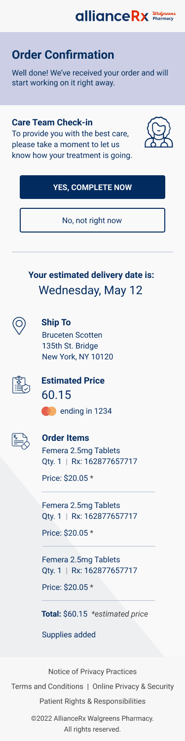
EZ Mobile Reorder • New WSP Brand
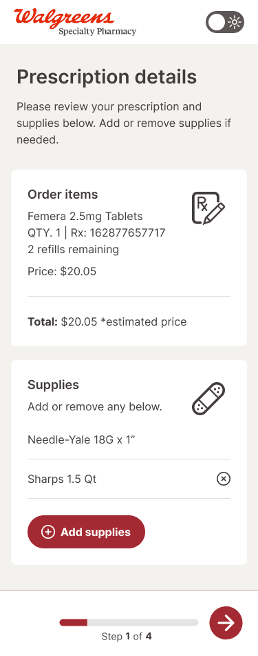
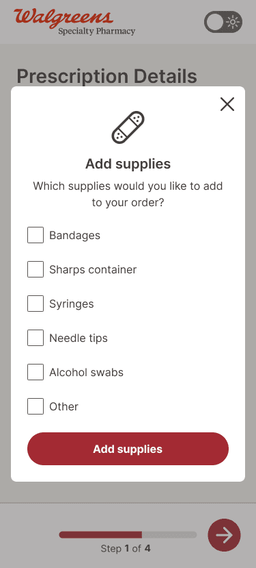
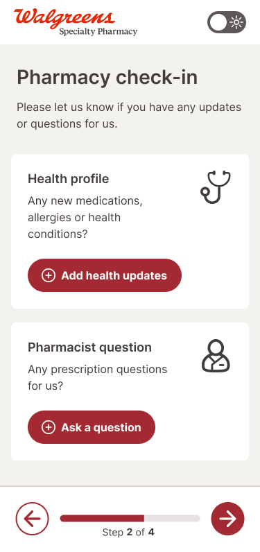
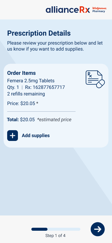
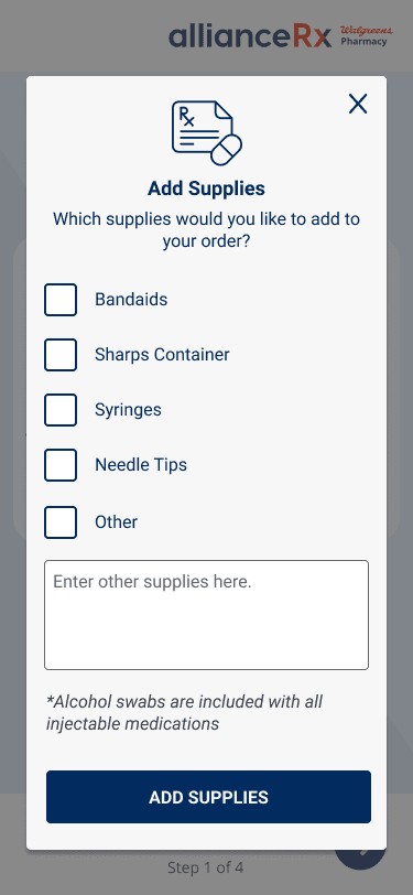
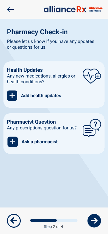
EZ Mobile Reorder • Old Alliance Rx Brand
Outcome & Summary
The WSP Design System is now the design foundation across the full Specialty Pharmacy digital portfolio. Each new product inherits its clinical accessibility standards, spatial logic, and component library, without needing to re-litigate those decisions from scratch.
Products currently built on the WSP Design System:
EZ Mobile Reorder (Shipped)
Walgreens Mail Service website (Shipped)
New Patient Onboarding / NPO (Shipped)
NPO Rearchitecture (In development, est. Q1 FY 2027)
Jump Pad Payment Management Enhancement (Shipped)
Community-based Specialty Pharmacy / CBSP (In development, est. FY 2027)
The system also changed how design decisions get made and defended. A documented, principled component library means every layout choice has a rationale behind it instead of being a visual preference. For a product area serving patients with serious conditions, that accountability matters.
Challenges and Tradeoffs
Building a clinical design system inside a retail organization comes with constraints that have no clean design solution. An outside agency designed the Walgreens branding and system palette without deep UX expertise in healthcare or accessibility. The biggest issue: Walgreens' Design System uses primary crimson, the brand's signature color, as both its primary interactive state and its error state. As part of the Walgreens umbrella, I didn't have the authority to redesign the global color system, not even just the feedback colors. So instead of fighting a battle I couldn't win, I designed around it. It's still an ongoing challenge.
A Major [Crimson] Red Flag:
In a clinical context, conflating "selected" with "error" is a real usability problem. A patient confirming a medication refill shouldn't have a moment of doubt about whether a red button means "submit" or "something is wrong." This required careful work at the component level, using shape, label, and layout to keep selection, action, and error states visually distinct even when they share the same base color.