Food Finder App POC
A Visual Feed for Food Discovery
A proof-of-concept from my time at Israel Tech Challenge, a full-stack bootcamp. I defined the product direction and designed the core experience, from concept through prototype, then used AI tools to bring it to life.
Role
User strategy, UI direction
Deliverables
Concept prototype
Assumption
Killing the “I Don’t Care, You Pick” Loop
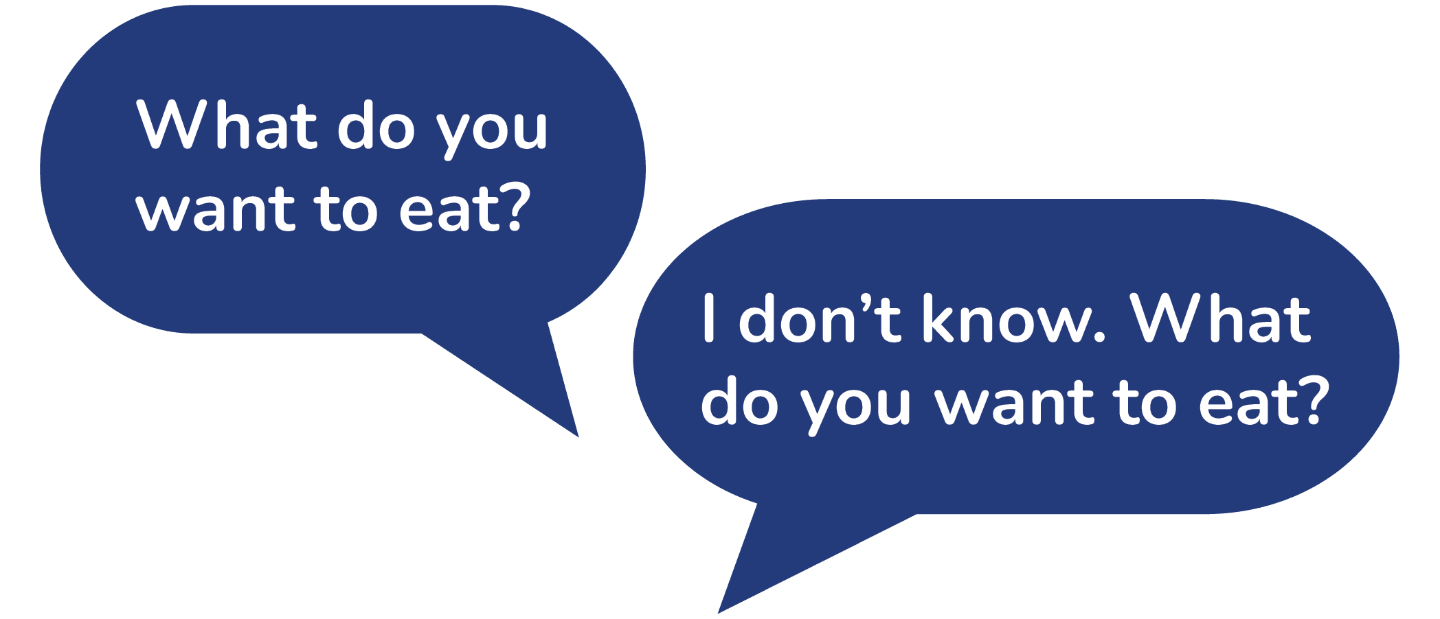
This happens more often than people think, and it adds up to a lot of wasted time and mediocre choices.
The assumption:
People often don't know what they're in the mood for
Others default to indecision to accommodate the group
Existing tools assume you already know what you want, because they're built around intent-based search (e.g., "Thai food," "brunch," "restaurants near me")
General searches require guessing the right keywords
Reviews are subjective and often conflicting
Content is buried in long-form blogs or scattered across platforms
Great local spots are often invisible unless you know what to look for
The result: decision fatigue and time wasted on choices nobody's happy with.
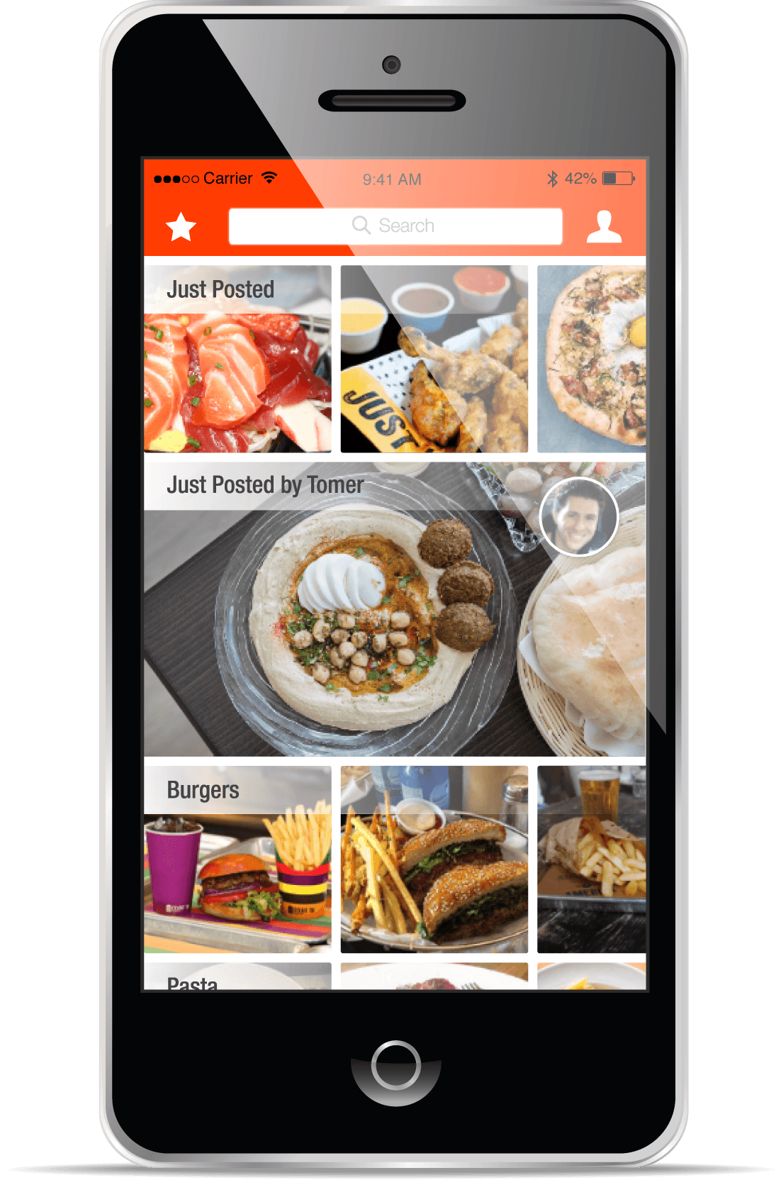
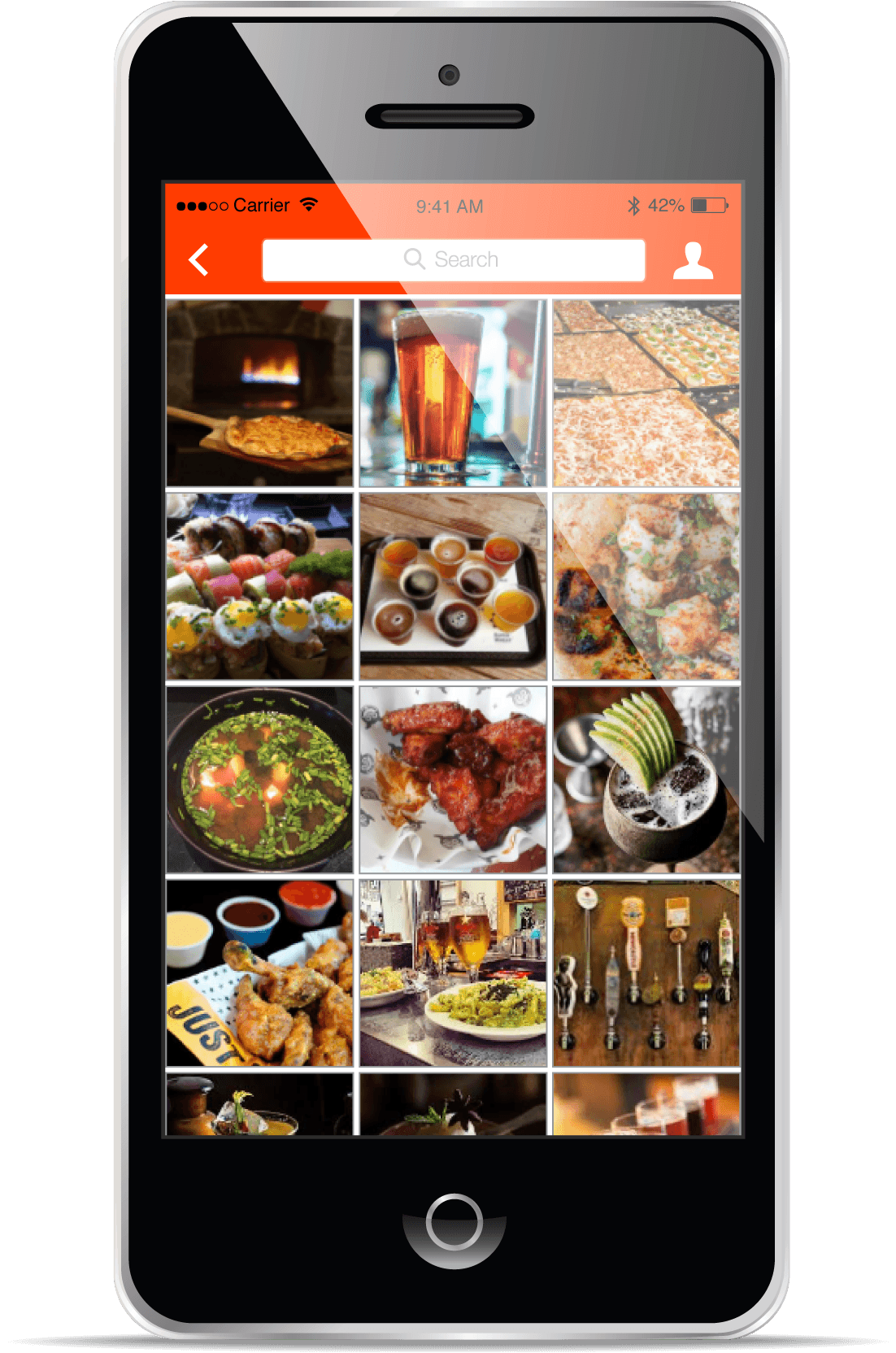
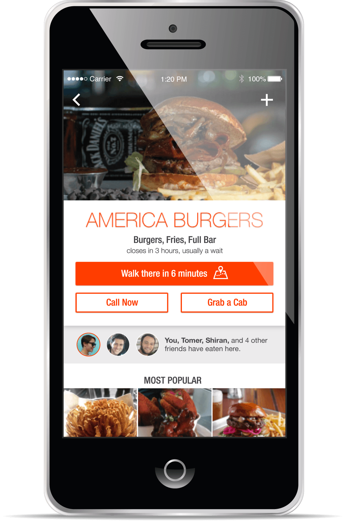
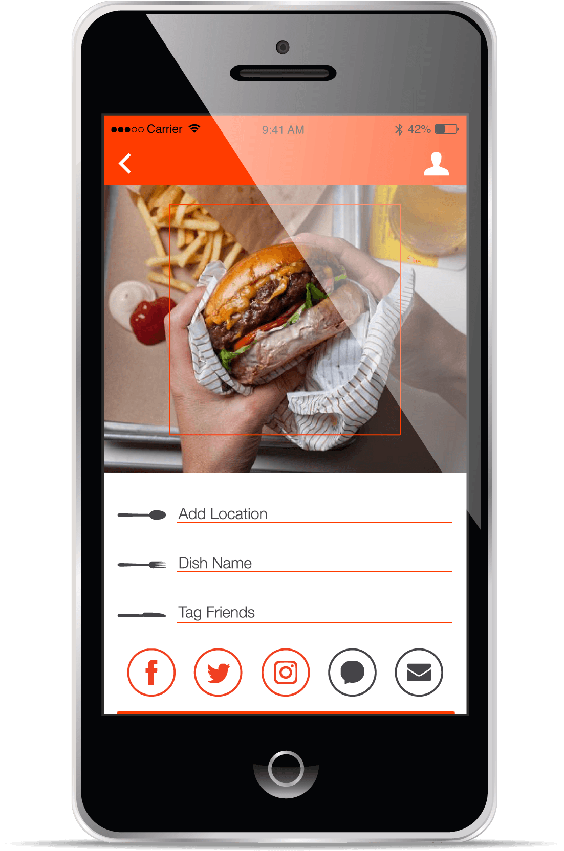
Original mock-ups
Key Features
Designing for Indecision
Instead of keyword-based searching, users can browse real, recent food near them and could make faster, more confident "gut" decisions without needing to know what they want upfront. We focused on a tight MVP to validate the core behavior: fast, visual decision-making without search.
Real-time, user-generated food photos
The foundation of the experience: what are people actually eating right now. No reviews, no long descriptions, just immediate visual signal. Content is primarily user-generated, supplemented by scraped imagery from sources like social media, Google Maps, Yelp, and restaurant-provided photos, so even less active areas have enough density and variety to feel alive.
Recency-driven feed
A ranking model that prioritizes recent, relevant content, so users see what's good right now instead of what was popular months ago, with light filtering still available when needed.
Location-based discovery
Content is surfaced based on proximity, making discovery hyper-relevant. Users can explore a specific area and move straight from browsing to action with one-tap directions through native maps.
Swipe for the undecided
For users who don't know what they want, a swipe-based flow, akin to dating apps, removes the need to search entirely. Set a few lightweight parameters, then quickly pass or "grabbit," turning indecision into momentum.
Lightweight content classification
Images are organized using metadata and simple categorization (e.g., burgers, sushi, drinks), making content browsable without requiring manual tagging or effort from users.
Claude Code
Before writing any code, I asked Claude what it needed from me to actually build something good. That answer shaped how I approached every project after. I structured my prompts around six elements and came into each one prepared:
Full product scope
Clearly defined MVP features, including how each functioned and how users would navigate between them, removing ambiguity upfront.
Target user
Grounded decisions around tone, density, and interaction patterns.
Aesthetic direction
Provided my original mockups as a starting point to avoid generic AI outputs, then iterated heavily to refine the look and feel.
Key interactions
Prioritized the moments that mattered most, like swipe decisions and browsing flow, so the prototype focused on behavior instead of just screens.
Technical constraints
Specified the environment (e.g., React, state handling), which helped produce something closer to a real, working system.
A creative north star
Defined the one thing the product needed to feel like, so decisions stayed cohesive even as we iterated.
The first result was pretty great. From there, it was a lot of back and forth, getting the right open-source images to match each restaurant, building out mock data so the app actually felt real. I also caught a few bugs along the way. One example: the map's z-index was sitting higher than the Restaurant Sheet, so the map was staying on top in map view. Having some coding knowledge from a bootcamp I did made a real difference. I could articulate exactly what needed to change, which made the fixes fast and precise.
The quality of what comes out is a direct reflection of the direction you put in. I treated Claude like a collaborator I had to show up prepared for, iterating constantly and catching what it couldn't.
Future Enhancements
Building Toward Something Bigger
This was an idea I'd been sitting on for a while. I always believed it could work. Finally building it felt like a long time coming, and turning it into something real was one of the more exciting things I've done creatively. I plan to keep building on it, and maybe even find funding someday.
A few things I'd want to tackle next:
UI Overhaul
The point of using AI was to get the idea to work, not to take it as-is and ship it. Yes, I had Claude make some tweaks for the purpose of building the concept, but it's still generic and not human.
Profiles & Content Ownership
Simple user profiles with the ability to upload and manage your own content. Authentication would be phone-based (SMS) or social login. No email and password nonsense.
A Social Layer
Let people follow friends and restaurants and save favorites, so food discovery feels collaborative instead of solo. Half the fun of finding a good spot is sharing it.
"Swipe Together" for the Undecided Feature
Share a link, swipe at the same time, and when you match, you go. It takes the whole "I don't care, where do you want to go" conversation off the table.