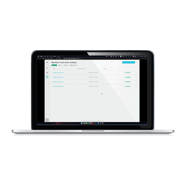
VIEW POLICY RESULTS
SUMMARY Noble's MVP is its Policy Builder, where businesses can create custom credit solutions from pre-licensed credit sources or custom data points. Once a policy runs and a decision is automatically assigned, the client can view the results in detail. This is also where clients can troubleshoot why a policy might not have run successfully or failed to render a decision.
MY ROLE
-
UX Flow and User Cases
-
UI
-
Prototype
-
Design System Updates
THE CHALLENGE
This flow was previously View Only. Our beta users advised that the existing view didn't provide them with insights into why a policy didn't execute or why a policy result in Pending Review.
Businesses and their underwriters needed to understand the result of a policy's decision, so they could make informed changes if desired. Most importantly, our users needed to specifically review policies that resulted in Pending Review, so they could investigate and decide whether to approve a customer for a credit loan or to reject them. Additionally, if a policy resulted in an error, meaning there was in executing the policy and a decision could not be rendered, the underwriter wanted to be able to understand the error, resolve it, and rerun the policy.
THE SOLUTION
This was a complex flow with many use cases. Highlights of the main view screen include:
-
Customer name
-
Current policy that was executed and the automatic decision that resulted (Approved, Pending Manual Review, Rejected, Error)
-
View all the connected data sources that were referenced in the policy
-
Each check is listed by name and the user can quickly assess if it passed or did not pass.
-
Capability to expand each check and see the exact line of JSON code that resolved the check
In the design system, there was a drawer component, an extending side panel, that would overlay the main content. I tried this as a solution to display all the pertinent information about the data source connection without losing the visuals of the actual policy results below the fold. The drawer also gave us a solution for the user the resolve certain errors themselves and see details about the company found in that data source, as well as display the downloaded reports in JSON format.
A few examples of a successfully executed policy


Self-serve error resolutions

Pending execution due to third-party delay


Error that requires Noble's assistance

THE OUTCOME
This solution was a huge success amongst the internal team. I was able to pack a lot of information about the data source into a condensed space. This allowed the user to view all relevant information in the same viewport in a clean and readable way.We shared the prototype with the user and they felt that this solution resolved their requirements.
*As this was the first version of this self-serve feature, there is no data to know if this improved their experience beyond that of the feedback they provided us at the time of the review. Additionally, my departure preceded shipping this feature.
THE PROCESS
This project began with the VP of Product and Product Manager (PM) having a call with our beta user to understand the requirements. The Product Manager then wrote a Product Requirements Document (PRD) for the new flow. A few tasks outlined in PRD included:
-
Display all the data sources used in the policy
-
Show the "three-step" connection process for each data source, so the user can understand where a connection might fail
-
Show different error types that might occur during the connection
-
Provide a self-serve solution for certain errors that can be solved by the user
-
Provide the user information when a connection error cannot be solved by themselves, and how to contact Noble for assistance
-
Show each check and their result (Pass/Not Pass)
-
Show the decision that resulted from each check (Approved, Manual Review Required, Rejected, Error)
-
Show the policy decision (Approved, Pending Review, Rejected, Error)
-
Each check should expand to show the condition statement and the data that resolved the statement
I started this project by sitting with the engineer who built the initial view to learn what happens when a policy first executes. This helped me to understand the "three-step" connection process that the PM outlined in the PRD. I consulted with the PM to understand the different use cases and what actions the user would need to take to resolve an issue if any arose.
Since we had a good start on a design system, I was able to quickly create mock-ups and review them with the lead engineer and PM. The most challenging part of this feature was creating a scalable "progress bar" that showed the "three-step" connection process for each data source. We needed to clearly be able to show where an error might have occurred in the connection process so the user could quickly resolve it and rerun the policy. However, a progress bar simply ate up too much real estate and wasn't scalable.
In the design system, there was a drawer component, an extending side panel, that would overlay the main content. I tried this as a solution to display all the pertinent information about the data source connection without losing the visuals of the actual policy results below the fold. The drawer also gave us a solution for the user the resolve certain errors themselves and see details about the company found in that data source, as well as display the downloaded reports in JSON format.
This solution was a huge success amongst the internal team. I was able to pack a lot of information about the data source into a condensed space. This allowed the user to view all relevant information in the same viewport in a clean and readable way.
A few discarded concepts


HINDSIGHTS & LEARNINGS
-
There was a very complex process happening below the surface. Since Noble is a small start-up, the developers intimately understood how the product functioned. I relied heavily on them to understand how this flow functioned so I could understand how the user needed to use this feature.
-
There was a lot of pressure to solve this solution quickly. However, the complexity of this flow was completely misunderstood by the entire product team, myself included, and we vastly oversimplified how to solve this challenge.
-
As a result, we went down a rabbit hole with a progress bar style solution, which was completely unscalable.
-
In my naivety as a designer, I thought because we had enough of a design system, it would faster to take these existing components and move them around in order to get feedback faster from the team. I should have started sketching wireframes to understand what types of elements I needed to display and how much real estate they would take up. I think wireframing would have led us to more creative, scalable solutions sooner.