NEW USER REGISTRATION
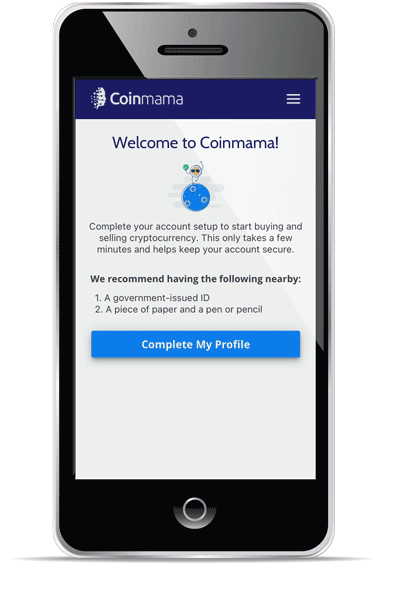
SUMMARY As a financial service, Coinmama is required to verify the identity of all new users for security reasons and to avert potential fraud risks. As such, new users need to upload personal information and documents for verification, such as their name, birthday, and address or their driver’s license or passport.
MY ROLE
-
Competitor Research
-
Wireframes
-
UI / Design System
-
QA
THE CHALLENGE
We found significant abandonment in the existing flow when users needed to upload identification documents for verification. Without documents being uploaded, the user cannot complete the registration process and not use Coinmama's services.
Cryptocurrency is popular because of its anonymity. How we do get the user to feel comfortable uploading documents that reveal their identity and other sensitive information?

I brainstormed possible assumptions about what might cause users to abandon the registration process at this stage.
Assumption 1: Psychological barrier
Is the user uncomfortable having to provide sensitive information?
Possible solutions:
-
Inform the user how long the process will take up front
-
Tell the user what security measures we take to ensure that we will handle their information with care
-
Benefits or incentives
Assumption 2: Technical barrier
Is it easy to upload the necessary documents?
Possible solutions:
-
Allow users to start the process on their desktop and upload documents quickly by taking photos with their phone
-
Improve instructions, provide clarity about what to do
-
Use third-party verification services (e-KYC) to get more users confirmed faster and through the checkout process why they are still engaged
THE SOLUTION
I worked closely with my product manager and the lead engineer to create a mobile-first website with mobile-specific interactions to make it easy and fast for the user to upload documents straight from their phone.


We also created a desktop-to-mobile transition that allowed users who started the process on their computer, to finish the process on their phone, removing the clumsy process of emailing photos to themselves and then having to hunt for files on their computer.


THE OUTCOME
We ran two “slow releases” to test out the new flow. The goal was not only to check that the new flow did improve the success rate for users to upload the required documents, but also to test for bugs or any other potential issues that might arise.
First release - 30/70
-
We opened the new flow to 30% of users from our largest volume countries (USA, Canada, UK, Germany, and Australia)
-
The rest of the users continued to see the original flow
-
After two weeks, we saw a 5% improvement in users that finished the full registration flow and a 2% increase in first-time buyers.
Second release - 50/50
-
Then we extended the new flow to 50% of total users
-
We know that 70% of our total user base live outside of the USA. We wanted to confirm that users in smaller, developing countries were also having a successful experience uploading IDs from their mobile phone
-
After two weeks, we saw a 6% improvement in users that finished the full registration flow and a 5% increase in first-time buyers.
Third release - Full
-
After these results, we felt confident to release the new flow to all our users
After 30 days, the new registration and verification process increased the number of users successfully completing the registration process by 14% and first-time buyers increased by 5%.
After extensive competitor research, mainly going through the onboarding and verification flow of other cryptocurrency platforms, I created a new onboarding flow that, while required the user to take more “clicks”, provided the user with step-by-step instructions to ease their doubts and help them complete the process in one go. The desktop flow offers users a seamless connection to upload their documents using a mobile device.
THE PROCESS
The new user onboarding flow was a complete redesign, including the signup form. As the only designer at Coinmama, I was in charge of the end-to-end flow. During this time, I was also working on building a Design System and used this feature to ship the first version of the new clean, coherent design.
COMPETITOR RESEARCH I focused the research only on competitors in the cryptocurrency space, such as Coinbase, CEX.io, Blockchain, etc. Since the problem we encountered was specific to identification verification, I went to companies that would require this step in the registration process. I registered myself as a user through the desktop process and mobile or mobile application, if relevant.
WIREFRAMES I sketched out some simple wireframes on paper and taped them to a wall to review with my product manager, the lead engineer, and other stakeholders. We thought about the best order for the flow - do we ask the user for personal information first or have them upload their documents first? I had seen it both ways in my research. We also discussed any potential technological bottlenecks and brainstormed creative technical interactions, such as the desktop-to-mobile transition.
UI / DESIGN Coinmama's existing design was incohesive, with different colored buttons, fonts, sizes, etc. I took a few of these elements and made them "the design system" and built cohesive components from them that could easily be reused in the future. The goal. here was not to overhaul Coinmama's design from scratch, but make the website design cleaner.
QA Before shipping, I checked the new flow for design and basic functional bugs. I documented all the bugs and determined which were high priority, to fix before shipping, and which could be fixed at a later time.
HINDSIGHTS & LEARNINGS
-
Even though I created wireframes, I did not first create a flow chart. This would have insightful to see a big picture of how the user would navigate through the flow and how to predict, prevent, or handle user errors.
-
Since this was the first time using the design system in production, I discovered that some component behaviors were not thoroughly thought through, such as input field validation, input placeholders, and disabled-buttons.
-
I was challenged to get buy-in from the engineers regarding the disabled button since from a developer perspective, the "disabled" button isn’t actually disabled. The user can click the button and this is how I chose to validate the input fields. However, I later learned that this isn’t correct behavior.
-
The drag-and-drop feature isn’t as intuitive as it could have been. It was not able to be scaled to other uses.